
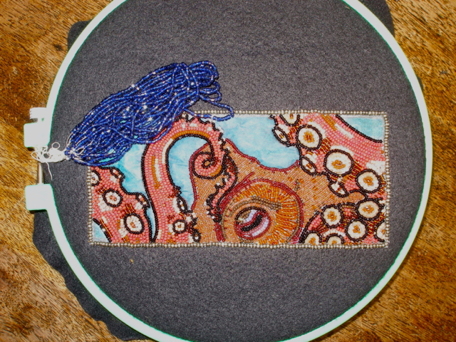
Okay, I'm having a really hard time deciding on a background color for my octopus. I love him so I want it to be right. It's drawn in a green/blue turquoise but I think I might like the navy. Or the sparkle antique blue. Or the Montana blue. Please let me know what you like! I'm starting on my next piece and putting this on hold until I get some feed back. Thank you!!!
 |
| 1. antique cut glass blue |
 |
| 2.dark green turquoise |
 |
| 3. montana blue |
 |
| 4. medium transparent blue |
 |
| 5. navy blue |
well, I like #4 best...what ever contrast bead looks best. Love this guy!!!
ReplyDeleteI like the dark green turquoise. It allows a good contrast to the dark outline of the octopus. And appears to be a good complimentary color to the colors of the octopus.
ReplyDeleteI also like the dark green turquoise. Looking forward to seeing what you do!
ReplyDeleteThe antique cut beads might give it a watery look. So cool, you never. Cease to amaze me.
ReplyDeleteThe antique cut beads might give it a watery look. So cool, you never. Cease to amaze me.
ReplyDeleteI like 2, the turquoise but then I like turquoise. It would give it a Caribbean feel. My second choice would be 1 for the water like sparkle.
ReplyDeleteI think a toss up between the navy n turquoise.
ReplyDeleteTurquoise.......beautiful piece.
ReplyDeleteWell I've decided on the navy. Everyone was very helpful, thank you! Picture coming soon.
ReplyDeleteKate I like the Med trans blue. I think it would make your little octopus pop.I love your work. I want to try and do something small that is inspired by your work. I can only hope to be 1/4 as good as you. Keep up the good work.
ReplyDelete